By Cairo Studio, Studio 6 min read
Ask where a palette came from and you often get the name of an app, a trending gradient or a competitor. The palettes we are proudest of came from somewhere you can stand. Most of them came from Cairo.
Colour is a place
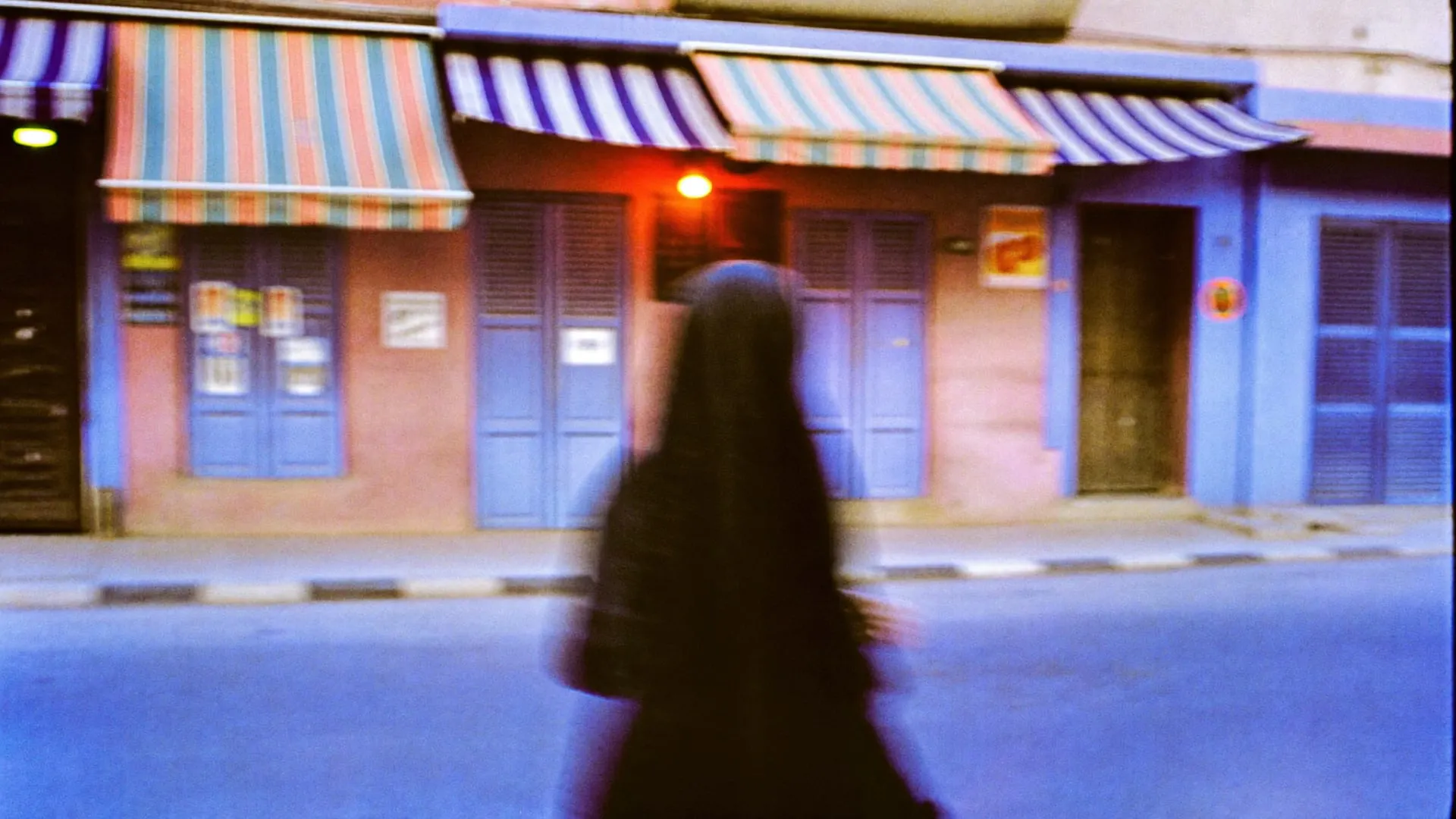
There is an ochre here that lives on every unfinished building, the colour of raw brick waiting for a facade. There is the deep red of a faded shop awning, the grey green of the river at dusk, and a white that is never quite white because of the dust. None of these sit in a default swatch library. All of them show up in our work.
When a palette comes from a place, people feel it before they can explain it. The brand looks like it grew where it stands. For MASAR we chose a deep forest green, an ivory and one clay accent, because a law firm that talks about planning early should feel calm and long term, with one warm thing to look at.
The light does half the work
A colour is a value under a specific light. Cairo light is hard, bright and a little warm, and it flattens soft palettes into mud. So we test colour outdoors, on a phone, at noon, not only on a calibrated monitor in a cool room. If a palette survives the harshest light it will meet, we trust it.
Colours we keep coming back to
- Unfinished brick ochre, warm without being sweet.
- Awning red, our one reliable shout.
- Dust white, a white that admits it lives in a city.
- River grey green, the calm under the noise.
Against the universal palette
The internet pushes everyone toward the same safe colours: soft blues and friendly purples that offend no one. They work. They also come from nowhere. We would rather a brand be clearly from somewhere, because belonging is worth more than being inoffensive.
Colour theory still matters and we use it every day. It can tell you two colours will sit well together. It cannot tell you what a red means on a particular street to the people who grew up there. For that you have to leave the desk, and the best palette decisions this studio has made were made on a balcony, looking down.