
Eyva
2025Site for an AI portfolio-intelligence platform used by beauty and personal-care teams.
UI/UX Design, Web Development, Creative Direction, Digital Design

Research, UX strategy and interface design for websites, web apps and mobile apps, delivered as systems your engineers can build.
Research, UX strategy and interface design for websites, web apps and mobile apps, delivered as systems your engineers can build.
We learn the business, the users and the numbers, and audit whatever exists: product, analytics, support tickets. The brief gets rewritten together until it says what the design has to achieve.
User interviews
UX audits & heuristics
Analytics review
Personas & journeys
Information architecture
Usability testing
Marketing sites
Landing pages & funnels
Editorial layouts
Arabic & English RTL layouts
Motion & scroll storytelling
Conversion-led pages
Web apps & SaaS
Dashboards & admin panels
Mobile apps (iOS / Android)
Onboarding & empty states
Complex forms & tables
Accessibility
Component libraries
Design tokens
Figma variables & variants
Interaction specs
Engineering handoff
Design QA in the build
User interviews
Usability testing
UX audits
Analytics review
Journey mapping
Surveys
Information architecture
Task flows
Wireframing
Content modelling
Accessibility
RTL & bilingual layouts
Interface design
Design systems
Design tokens
Iconography
Data visualisation
Motion & micro-interactions
Figma prototypes
Protopie
Interactive demos
Code prototypes
User testing
Stakeholder reviews
Figma
FigJam
Protopie
Maze
Hotjar
Storybook
From research to tokens, one system all the way through.
Site for an AI portfolio-intelligence platform used by beauty and personal-care teams.
UI/UX Design, Web Development, Creative Direction, Digital Design
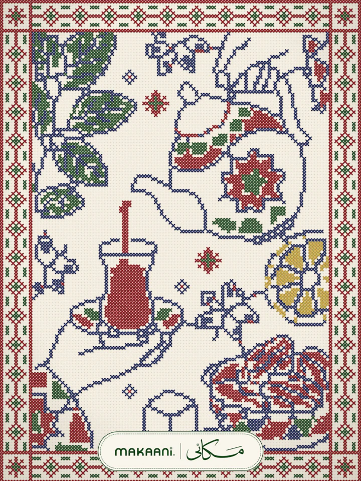
Magazine and membership network connecting diasporas across the Arab world, Africa, Asia and Latin America.
Web Development, UI/UX Design, Product Design, Branding
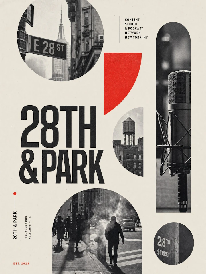
Content studio and podcast network in the Flatiron district of New York.
Web Development, UI/UX Design, Creative Direction, Digital Design

Site for a digital agency, in English and Dutch, built on Next.js and Prismic.
Web Development, UI/UX Design, Creative Direction, Digital Design
Research and scope
Flows and prototypes
Interface design
Systems and handoff
User interviews
Reviews of competing apps
First version feature priorities
Success criteria for each flow
Structure and content
Visual design
Bilingual and RTL
Motion and handoff
Sitemap and page hierarchy
Content audit for redesigns
Messaging and page copy direction
Wireframes with real content
UX is how the product works: the research, the structure, the flows and the decisions about what appears where and why. UI is how it looks and feels: type, colour, spacing, components and motion. We do both, in that order, because a beautiful interface on a confusing flow still loses users, while a clear flow with a plain interface can be polished later.
Yes. Marketing websites, landing pages, web apps, dashboards, admin panels and native mobile apps for iOS and Android. The same research and design system thinking applies across all of them, and because we also build websites, platforms and apps, the design is always made with an engineering team in mind rather than handed over as pictures.
That is a large part of our work. We audit the current product against analytics, support tickets and a few user sessions, keep the flows people already understand, and fix the ones where they hesitate or drop off. The redesign lands as one consistent system, and it can ship in phases so your team never has to freeze the roadmap for months.
We design both directions from the first wireframe: mirrored layouts, Arabic type chosen to match the Latin in weight and size, numerals and date formats decided per market, and components that flip correctly including icons, progress bars and charts. Both languages are reviewed with native readers, so the Arabic version is never a machine-translated afterthought.
Research is how we replace opinions with evidence. Depending on the product it includes user interviews, usability sessions on the current product, an analytics review, a competitor teardown and a heuristic audit. A small project needs a week of it; a complex product needs two or three. Skipping it is possible, but it usually costs more later in rebuilt screens.
A system. Every project is built from components, tokens for colour, type and spacing, and variants for every state: default, hover, loading, empty, error, success, disabled, and both language directions. It is organised in Figma with specs, so engineers build consistently and your team can design new screens later without starting from scratch.
Figma for design and design systems, FigJam for workshops and flows, Protopie or Figma prototypes for interaction testing, Maze and Hotjar for testing and behaviour analytics, and Storybook when we work directly with an engineering team. Files are set up in your own Figma workspace so you own them from day one.
A marketing website runs 3 to 5 weeks. A web app, dashboard or mobile app runs 6 to 8 weeks depending on the number of flows and states. Large platforms are broken into sprints that run alongside development. We work in weekly rounds, so you see and comment on real progress every week instead of waiting for a big reveal.
It is scoped by the number of flows and screens, the research needed and whether a design system is built from scratch. A website design, a product redesign and a full app with onboarding, payments and settings sit in different ranges. After a short call we send a fixed quote per phase, with payment tied to research, design and handoff milestones.
Yes, whenever the product has real decisions to validate. Clickable prototypes go in front of five to eight users per round, in Arabic or English depending on the audience, and we watch where they hesitate. Changing a flow in a prototype costs an hour; changing it in production code costs a sprint, so testing pays for itself quickly.
Yes. We hand over specs and tokens, walk the engineers through the system, and stay in the build for design QA so the shipped product matches the design. We can also join your team for a sprint or two when a product needs extra design capacity. Many clients pair us with their own developers or with our own engineering team.
Yes. Colour contrast, touch target sizes, focus states, keyboard navigation, readable type sizes and screen reader labels are designed in, not patched later. We aim for WCAG 2.2 AA on every project and document it in the system, which also improves usability for everyone on a cheap phone in bright sunlight.
Yes. A landing page, a checkout flow, an onboarding sequence or one new feature inside an existing product are all common engagements. We fit into your existing design system if you have one, and if you do not, we design the piece so it can become the start of one.
Yes. Transitions, micro-interactions, scroll behaviour and loading states are part of the design, prototyped in Protopie or code so engineers see exactly how they should feel. Motion is used to explain state changes and guide attention, never as decoration that slows the product down on a mid-range phone.
We stay in the build for design QA, then watch analytics and session recordings after launch to see how people really use the product. Small improvements, new screens and experiments can run on a light monthly retainer, so the design keeps up with the business instead of drifting the moment the project ends.